
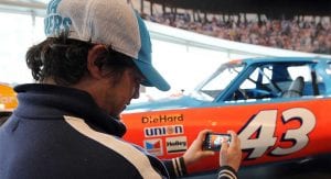
Mark Barrera’s cubicle at Hendrick Motorsports has a Dallas Cowboys football on the shelf, a Rubik’s Cube on the desk and secrets in the computer. As a graphic artist, he designs the team’s race cars and thus maintains a strict devotion to privacy.
When outsiders make appearances at his work area, he checks his screen to make sure nothing on it reveals how any of Hendrick’s unreleased cars will look. He’s especially cautious about Darlington Raceway throwback cars, because leaks of those are notorious. He never knows which visitor to his work station might be a secret Reddit poster.
Barrera hosted a surprise visit in mid-July for a conversation about this weekend’s throwback cars at Darlington, and he made a quick scan of his station to make sure there was nothing an outsider shouldn’t see. Even though those cars eventually will be raced on live TV in front of millions of people and exist in large part so fans will see and then buy the products on the side of them, it is important to keep them under wraps until the time is right.
RELATED: See Darlington throwback schemes
On that day, two of Hendrick’s special paint schemes had been released, but two had not. Alex Bowman’s No. 88, which pays tribute to Tim Richmond‘s No. 25 Folgers car from 1986, already had been released so Barrera was free to discuss it. He usually tries to conform precisely to the old design – otherwise, he asks, what’s the point? – but in this case, he had to make exceptions, most notably for the numbers.
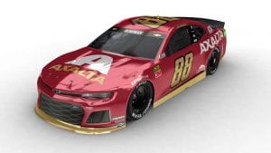
Changing the look of the numbers on a car is a big deal, even during throwback weekend. Richmond’s 25 was big and blocky, but Bowman’s 88 remains the way it always is – sleek and slanted, giving the appearance of movement.
It was up to Hendrick’s paint team to turn the rendering into real life. There are multiple challenges with that. A 2-D drawing doesn’t translate exactly into a 3-D car. The colors on Hendrick’s painting shelves – “#24/88 Axalta blue” and “#88 Nationwide Blue” – would not be used and would instead be replaced by a red as close to Richmond’s as they could make.
MORE: First look at Jimmie’s throwback
Even with those wrinkles, Hendrick’s paint team, led by Kevin McCree, spent a few days this month turning a sheet metal body into a work of automotive art, following this recipe:
– Apply two coats of primer in a paint bay set at 97 degrees
– Bake at 120 degrees for 30 minutes
– Sand and clean
– Tape and degrease
– Spray with sealant
– Apply two or three coats of base paint, plus stencil and design work in bay set at 97 degrees
– Tape
– Bake at 145 degrees for an hour
– Untape
– Touch up as needed.
After Bowman’s car was painted, it was sent to the mechanics in a bay next to the paint station. McCree and crew watched mechanics work on it like mothers watching someone else hold their newborn. Few things annoy Barrera and McCree more than a Hendrick car taking the green flag anything short of pristine.
Mechanics don’t care about pristine, or at least not as much as Barrera and McCree. Every time they put a tool box on Bowman’s car … or brushed up against it … or looked at it with less than an adoring gaze, McCree and his guys got annoyed.
And don’t get them started about William Byron’s car in the July race at Daytona International Speedway. That car was one of their all-time favorites. The white, the glitter, the fades, the flames … man, it was beautiful … and it never made it into the race, as Byron crashed in a practice session after being hit from behind by Brad Keselowski.
Keselowski said he ran into Byron to “send a message” he was done lifting. It’s a good thing nobody from the paint team was around, because they might have tried to “send a message” to Keselowski in a manner that would have left Keselowski short of pristine.
While teams want every car to look great, they take particular pride in the throwback cars. Fans, drivers, sponsors, media, team owners, pretty much everyone in the sport zero in on how the cars look at Darlington, far more than any other weekend of the year.
For an answer why, let’s turn to McCree.
“Throwback anything is fun,” he said. “Old race cars are just cool.”
Colors come of age
McCree is right. Old race cars are cool. But really old race cars, not so much. If throwback weekend is a study in NASCAR history, it’s mostly recent history. If teams throw it back too far, the cars would be … well, they’d be boring.
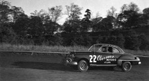
The first season of what is now the Monster Energy NASCAR Cup series was 1949. On the side of champion Red Byron’s Oldsmobile was his number, 22, plus the name of his one and only sponsor: Parks Novelty, which was owned by Raymond Parks, the owner of his team. All of that was painted by hand with a brush.
Last year, champion Joey Logano’s Ford – also No. 22 – featured vibrant yellow, deep red, Ford blue, pretty much every other color in the rainbow and included the names of 26 different companies.
The point of a NASCAR race has never changed: Go fast and get to the finish line first. The look of a NASCAR race has changed dramatically, from one-color, one-sponsor cars to today’s high-speed billboards touting enough products to fill a shopping cart. How did we get from designs that were an afterthought at best to men willing to fight over destroyed paint jobs? How did cars come to look like what they look like now?
The journey includes ideas meant to save a buck, innovations that made millions, crazy-sounding schemes that bore unbelievable results and epiphanies on the way to work.
Selling points and STP
The history of NASCAR paint schemes runs parallel with the history of sponsors. Every big change in paint scheme history happened because of sponsors. Those changes came in fits and starts. For NASCAR’s first 20 years, sponsors were almost entirely local body shops, garages and dealerships.
“It was pure economics,” said Kelly O’Keefe, head of creative brand management at Virginia Commonwealth University’s Brand Center. “Owners thought, ‘If I can get a little money from a local business to put a logo on the car, I’m going to do that, because it’s going to help subsidize the cost of my team and my crew.’ “
For years, those costs were low relative to what they are now, and so was the subsidy.
“The stock cars were used, often very used, and frequently re-built in a garage or barn,” said Jeffrey Richards, a professor in Michigan State University’s advertising and public relations department who is an expert in advertising history and who has photographed the Indy 500 for 46 years and the Brickyard 400 since its beginning. “The drivers weren’t well paid, either.”
In the early 1950s, officials from the car manufacturer Hudson discovered the race track was a good place to find customers. They also learned the faster the cars were, the more customers they would find. Tom Jensen, curatorial affairs manager at the NASCAR Hall of Fame and a journalist who covered the sport for two decades, said that led to the saying, “win on Sunday, sell on Monday.”
RELATED: More on NASCAR Hall of Fame
The first step toward a modern-looking car came in 1959. Late in that season, Lee Petty, the patriarch of the Petty family who won 54 races and three championships, was at a race. His sons, Richard and Maurice, remained behind at the Petty shop in North Carolina repairing a damaged Plymouth Fury. After it was sufficiently repaired, Richard, then 22, had to paint it.
At that point in the family’s racing career, the Pettys’ favorite color was apparently whatever they had in stock. Sometimes they fielded red cars, sometimes black, sometimes white.
When it came time to paint the Fury, Richard had two cans of paint – one can of 1956 Dodge blue, one can of 1957 Chevy white. But there wasn’t enough of either one to cover the car. So instead of buying a full can of one or the other or something else, the man who would become The King combined the two into one pail. He stirred the 1956 Dodge blue and the 1957 Chevy white into one hue.
When that make-do mixture was applied to the car, it was beautiful. It looked like the sky. When Lee Petty came home and saw it, he loved it. Petty Blue, as it became known, soon visited Victory Lane. From that day in 1959 through 1971, Petty cars were Petty Blue. They were Petty Blue when Richard Petty won his first race in 1960. They were Petty Blue when he won 27 races in 1967. They were Petty Blue when he won his first three championships (1964, 1967, 1971).
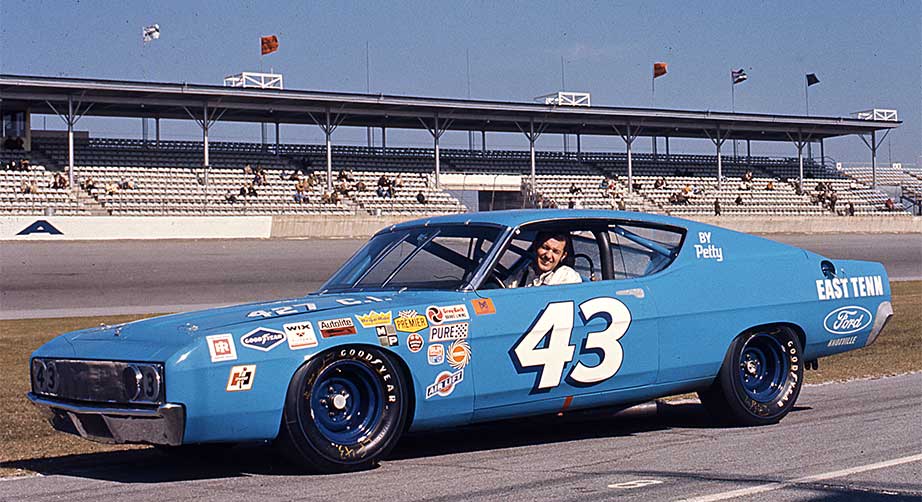
A few days before the 1972 season opener at Riverside, Richard Petty, his brother, Maurice, and crew chief Dale Inman flew to Chicago to meet with Andy Granatelli, president and CEO of STP, to discuss bringing STP on as a primary sponsor. A snowstorm socked Chicago as the negotiations dragged on. Maurice and Inman left to get to Riverside. Richard stayed behind to close the deal.
STP offered $250,000 – an enormous amount in those days – but Granatelli wanted the car to be not Petty Blue but Day-Glo red, like the cars STP sponsored in the Indy series. Petty wanted the money, but he wanted to keep his cars Petty Blue more because Petty Blue was his lucky color.
Granatelli offered another $50,000. Petty said no to that, too.
Petty flew out to California for the race. Although they didn’t have a signed agreement, both sides apparently felt good enough about the negotiations that STP stickers were affixed to the Petty Blue car. Petty won that race, a genius-level negotiating tactic.
When the contract arrived at the Petty shop before the next race (the Daytona 500), Granatelli included a clause calling for the cars to be Day-Glo red. Petty scratched it out … then signed the contract.
Eventually, Petty and Granatelli agreed the cars would be Petty Blue with a stripe of Day-Glo red, and the now-iconic scheme debuted in the 1972 Daytona 500.
Petty won eight races that season and finished a whopping 80 percent of events in the top five on the way to his second straight championship, the fourth of his seven overall.
As successful as that partnership was on the track, its impact in the sports world was arguably even greater. The paint scheme became a bridge between the company and fans.
“In many ways, that’s the one partnership that started to put NASCAR advertising on the map, and you started to see STP become a very well-known brand because of that,” O’Keefe said. “NASCAR advertising was one of the leaders in the world where now everything is branded. Companies like STP became household names overnight. That’s really the shot heard around the world related to NASCAR marketing and sports marketing in general.”
‘The Man in … Blue?’
Glory Road at the NASCAR Hall of Fame shows in vivid, living color the history of NASCAR paint schemes. The oldest cars are on the lower levels. They are plain and monochromatic. The paint schemes, if they can be called that, were unimpressive at best. Follow Glory Road, designed to look like a track, up the ramp, and the cars get newer and the paint schemes more colorful and elaborate.
The company names become more familiar, too. The appearances of Tide, Folgers and other household products signaled NASCAR’s growth beyond a regional sport. They also heralded another change: Paint jobs became far more sophisticated as companies tried to replicate the success of the Petty Blue and Day-Glo red STP car. More and more companies wanted to build their own bridges to fans and thought beautiful cars were the way to do it.
The vehicles on Glory Road change from time to time, but somewhere around the midpoint there is usually a car driven by Dale Earnhardt. He is so closely identified with his black Goodwrench car that it’s easy to forget he drove a blue-and-yellow Wrangler car for several years before the black car. As the Hall of Fame’s Jensen put it: “They don’t call him ‘The Man in Blue and Yellow.’ They call him ‘The Man in Black.'”
But he was almost The Man in Blue and White.
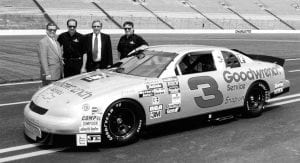
The first draft of what became Earnhardt’s black No. 3 Goodwrench Chevy was not black but blue and white.
“GM Goodwrench Parts wanted the car to look like a brake box,” said team owner Richard Childress, who still approves every paint scheme his team fields. “It didn’t do anything at all for me. The word ‘Goodwrench’ faded away.”
Childress built the car to the blue-and-white specifications anyway. In presenting it to Goodwrench officials, he left one side blue and white. On the other side, the team covered the car with black tape. Childress told Goodwrench officials that with a black car on a dark track, the white Goodwrench would stand out.
Goodwrench agreed, and black became Earnhardt’s color. He wore black sunglasses, black shirts and black jeans. He became The Intimidator, the Man in Black, the guy nobody wanted to see in his rear-view mirror. As never before or since, the car and driver became almost one entity.
As president of Dale Earnhardt Inc., Don Hawk used the synchronicity between car and driver to attract sponsors.
“My presentation was, ‘He’s got a swagger off the track and performance on the track that matches that black car,’ ” he said. “It started benign. It became cataclysmic. You couldn’t just paint your car black and be bad. You had to back it with execution.”
The impact of the deals Hawk made – with sunglasses companies, sneaker companies, fast food companies, soda companies and more – reached far beyond the insular NASCAR world. Now that bridge between product and fans had a super cool guide to lead you across it.
That would not have happened if the car was blue and white.

The rainbow connection
In May of 1992, Ray Evernham visited artist Sam Bass to buy a gift for Jeff Gordon, the young driver for whom Evernham would serve as crew chief starting with one race at the end of that season. Evernham had in mind a track program Bass had designed. Bass gave him the program for free in exchange for Evernham giving him a chance to design Gordon’s car.
Bass drew up two versions of the car, and on the morning of the deadline, as he drove to work, he had an idea for a third. He envisioned a car promoting the fact DuPont paint offered an array of colors.
“I was thinking about the (DuPont) oval on the hood and how the lines above it would naturally form a rainbow,” Bass, who died in February, told Autoweek. “I knew the moment I drew it, that this was the one.”
MORE: Remembering Bass through his art
DuPont reviewed 43 submissions for Gordon’s car and chose Bass’s rainbow design.
“I thought the guys in the body shop were going to kill me when they saw it because they knew how difficult it was going to be to paint,” Bass said. “But to their credit, they did it, and they were so proud of it.”
The bright colors did present one problem: They faded and had to be redone often.
Just as the black fit Earnhardt’s persona, the rainbow fit Gordon’s – it looked young, fresh, hopeful. The contrast between Gordon’s rainbow and Earnhardt’s black lined up perfectly with the contrast between the men who drove them. Fresh versus grizzled, youth versus experience, goody-two-shoes versus villain.
“It certainly changed my life forever as a race car driver to come to Hendrick Motorsports and having a paint scheme that now, looking back on it, was so iconic,” Gordon said. “There’s a certain magic that Sam Bass brings to your race car when he designs it.”

The secret in silver
From when major sponsors arrived in the 1970s through the mid 1990s, teams used one paint scheme for virtually every race in a season. Primary sponsors wanted the look to be consistent, a key component of any advertising strategy. That has changed in recent years, as most teams now have multiple primary sponsors instead of one, and thus multiple paint schemes instead of one.
But that’s a relatively new trend, and in 1995, having a car look different for one race was highly unusual. In 1995, NASCAR celebrated 25 years of collaboration with R.J. Reynolds. To mark that occasion, secret plans were drawn up for Earnhardt to drive a silver car instead of his black one in the All-Star Race. Hawk met with officials from diecast companies and RJR to forge a plan to sell the silver car idea to Childress and Earnhardt.
Hawk talked to Childress first, who told him to get approval from Earnhardt and come back. Changing the car color would have been a huge deal for any driver, even more so for Earnhardt. He didn’t like change for change’s sake, and he was very superstitious. Green cars and peanuts, for example, are considered bad luck in auto racing. Hawk would not have bothered bringing Earnhardt a green car or one sponsored by peanuts because the answer would have been not just no, but hell no.
Hawk presented the silver car idea to Earnhardt carefully. He backed into the subject, hemmed and hawed, like a child afraid to confess to his parents. “Just tell me,” Earnhardt said.
Hawk laid out his case. The silver car would make a killing in the diecast market. It would help the All-Star Race and NASCAR in general. It helped that the race was not a points race, so if Earnhardt finished poorly there would be no championship implications.
Earnhardt agreed to the change, and the secret was kept in a way that would have made Barrera proud. Nobody outside of a small circle had any inkling until an unveiling at Charlotte Motor Speedway. According to Danny “Chocolate” Myers, then Earnhardt’s gas man and now the curator at Richard Childress Racing’s museum, not even crew members knew the car had been painted silver.
“We pulled the car cover off,” Hawk said. “I thought the media was going to die when they saw a silver race car. I’m telling you, it still gives me goosebumps because nobody could believe it.”
That began a trend of teams bringing splashy designs to the All-Star Race, which bled into other parts of the season and eventually led to the introduction of throwback weekend at Darlington. There’s a direct, if not necessarily straight, line from Petty Blue to Earnhardt black to Gordon rainbow to one secret silver car and a driver who had to be talked into approving it to all the throwback designs that will scream across Darlington this weekend.
The thread connecting those paint schemes is, as McCree said, old race cars are cool.
“We still have a romance with cars,” O’Keefe said. “I think it’s exciting to see them roll out. I hope our world never gets so sophisticated that we lose that.”